Instagram Card
A versatile, responsive Instagram-style card component for showcasing user profiles with customizable photo galleries and multiple layout options.
Last updated on
A responsive Instagram-style card component that displays user profiles with configurable photo layouts, avatar support, and multiple size variants.
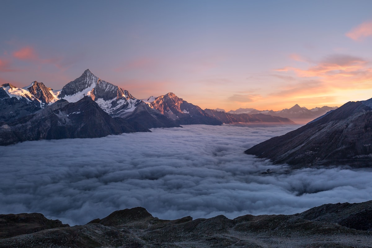
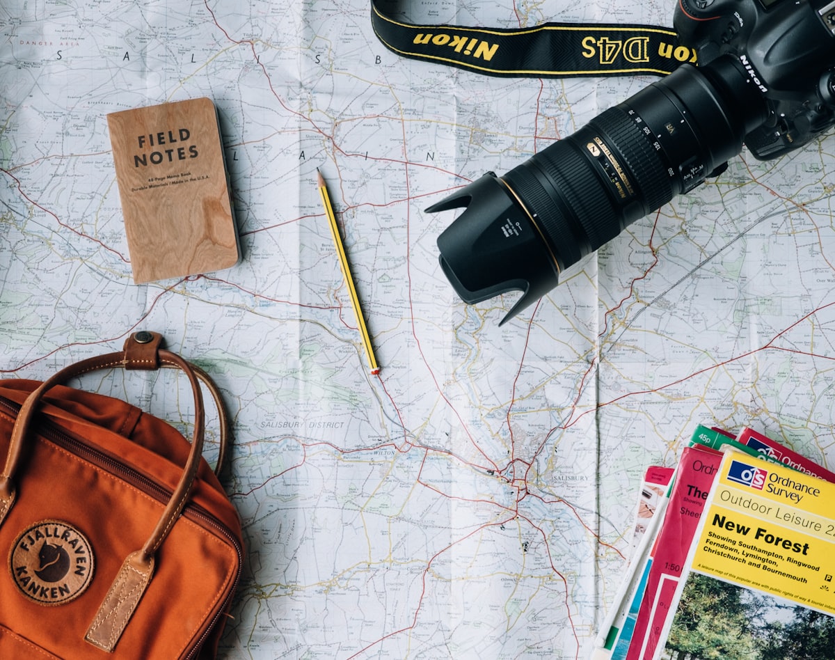
Travel photographer and content creator
Installation
npx shadcn@latest add @grenish/instagram-cardThis requires the @grenish registry in your components.json. See the installation guide for setup.
Manual Dependencies
If you prefer manual installation, add the base components:
npx shadcn@latest add card avatar button aspect-ratio itemUsage
import InstagramCard from "@/components/tools/instagram-card";

export default function Demo() {
  return (
    <InstagramCard
      profileName="Sarah Anderson"
      description="Travel photographer and content creator"
      avatarSrc="https://github.com/shadcn.png"
      photos={[
        "https://images.unsplash.com/photo-1506905925346-21bda4d32df4?q=80&w=1200",
        "https://images.unsplash.com/photo-1488646953014-85cb44e25828?q=80&w=1200",
        "https://images.unsplash.com/photo-1507003211169-0a1dd7228f2d?q=80&w=1200",
        "https://images.unsplash.com/photo-1494790108377-be9c29b29330?q=80&w=1200",
      ]}
    />
  );
}
import { Avatar, AvatarFallback, AvatarImage } from "@/components/ui/avatar";
import { Button } from "@/components/ui/button";
import { Card, CardContent } from "@/components/ui/card";
import {
Item,
ItemActions,
ItemContent,
ItemDescription,
ItemMedia,
ItemTitle,
} from "@/components/ui/item";
import { cn } from "@/lib/utils";
import { InstagramLogoIcon } from "@phosphor-icons/react/dist/ssr";
import Image from "next/image";
// Types
type InstagramCardSize = "sm" | "md" | "lg" | "xl";
type InstagramPhotoLayout = 1 | 2 | 3 | 4;
interface InstagramCardProps {
avatarSrc?: string;
className?: string;
description?: string;
photoLayout?: InstagramPhotoLayout;
photos?: string[];
profileName?: string;
size?: InstagramCardSize;
}
interface SizeConfig {
avatar: string;
button: "icon-xs" | "icon-sm" | "icon" | "icon-lg";
card: string;
cardSize: "default" | "sm";
contentPadding: string;
description: string;
gap: string;
itemSize: "default" | "sm";
mediaRadius: string;
title: string;
}
interface InstagramCardHeaderProps {
avatarSrc?: string;
avatarClass: string;
buttonSize: "icon-xs" | "icon-sm" | "icon" | "icon-lg";
description?: string;
descriptionClass: string;
initials: string;
itemSize: "default" | "sm";
profileName: string;
titleClass: string;
}
interface InstagramCardBodyProps {
contentPadding: string;
gap: string;
mediaRadius: string;
photoLayout: InstagramPhotoLayout;
photos: string[];
profileName: string;
}
// Config
const sizeConfig: Record<InstagramCardSize, SizeConfig> = {
sm: {
avatar: "size-9",
button: "icon-xs",
card: "max-w-xs",
cardSize: "sm",
contentPadding: "px-4",
description: "text-xs line-clamp-2",
gap: "gap-1.5",
itemSize: "sm",
mediaRadius: "rounded-2xl",
title: "text-sm",
},
md: {
avatar: "size-10",
button: "icon-sm",
card: "max-w-sm",
cardSize: "default",
contentPadding: "px-5",
description: "text-sm line-clamp-2",
gap: "gap-2",
itemSize: "default",
mediaRadius: "rounded-[1.35rem]",
title: "text-sm",
},
lg: {
avatar: "size-12",
button: "icon",
card: "max-w-md",
cardSize: "default",
contentPadding: "px-6",
description: "text-sm line-clamp-3",
gap: "gap-2.5",
itemSize: "default",
mediaRadius: "rounded-[1.5rem]",
title: "text-base",
},
xl: {
avatar: "size-14",
button: "icon-lg",
card: "max-w-xl",
cardSize: "default",
contentPadding: "px-6",
description: "text-sm line-clamp-3",
gap: "gap-3",
itemSize: "default",
mediaRadius: "rounded-[1.75rem]",
title: "text-base",
},
};
const photoLayoutClass: Record<InstagramPhotoLayout, string> = {
1: "grid-cols-1 grid-rows-1",
2: "grid-cols-2 grid-rows-1",
3: "grid-cols-[1.35fr_1fr] grid-rows-2",
4: "grid-cols-2 grid-rows-2",
};
// Utilities
function getInitials(name?: string): string {
return name
?.trim()
.split(" ")
.filter(Boolean)
.slice(0, 2)
.map((word) => word[0])
.join("")
.toUpperCase() || "";
}
function getPhotoSpanClass(
layout: InstagramPhotoLayout,
index: number,
): string {
return layout === 3 && index === 0 ? "row-span-2" : "";
}
// Components
function InstagramCardHeader({
avatarSrc,
avatarClass,
buttonSize,
description,
descriptionClass,
initials,
itemSize,
profileName,
titleClass,
}: InstagramCardHeaderProps) {
return (
<Item size={itemSize} className="border-0 rounded-none bg-transparent py-0">
<ItemMedia>
<Avatar className={avatarClass}>
<AvatarImage src={avatarSrc} alt={profileName} />
<AvatarFallback>{initials}</AvatarFallback>
</Avatar>
</ItemMedia>
<ItemContent>
<ItemTitle className={titleClass}>{profileName}</ItemTitle>
{description && (
<ItemDescription
className={cn(descriptionClass, "text-muted-foreground")}
>
{description}
</ItemDescription>
)}
</ItemContent>
<ItemActions>
<Button
variant="outline"
size={buttonSize}
aria-label="Open on Instagram"
>
<InstagramLogoIcon weight="duotone" />
</Button>
</ItemActions>
</Item>
);
}
function InstagramCardBody({
contentPadding,
gap,
mediaRadius,
photoLayout,
photos,
profileName,
}: InstagramCardBodyProps) {
const visiblePhotos = photos.slice(0, photoLayout);
if (visiblePhotos.length === 0) return null;
return (
<CardContent className={contentPadding}>
<div
className={cn(
"grid w-full overflow-hidden aspect-square",
gap,
mediaRadius,
photoLayoutClass[photoLayout],
)}
>
{visiblePhotos.map((photo, index) => (
<div
key={`${photo}-${index}`}
className={cn(
"relative min-h-0 overflow-hidden",
getPhotoSpanClass(photoLayout, index),
)}
>
<Image
src={photo}
alt={`${profileName} photo ${index + 1}`}
fill
className="object-cover"
sizes="(max-width: 640px) 100vw, (max-width: 1024px) 50vw, 33vw"
/>
</div>
))}
</div>
</CardContent>
);
}
export default function InstagramCard({
avatarSrc,
className,
description,
photoLayout = 4,
photos = [],
profileName = "",
size = "md",
}: InstagramCardProps) {
const config = sizeConfig[size];
const initials = getInitials(profileName);
return (
<Card
size={config.cardSize}
className={cn(
"w-full border border-border/60 bg-card/95 shadow-sm",
config.card,
className,
)}
>
<InstagramCardHeader
avatarSrc={avatarSrc}
avatarClass={config.avatar}
buttonSize={config.button}
description={description}
descriptionClass={config.description}
initials={initials}
itemSize={config.itemSize}
profileName={profileName}
titleClass={config.title}
/>
<InstagramCardBody
contentPadding={config.contentPadding}
gap={config.gap}
mediaRadius={config.mediaRadius}
photoLayout={photoLayout}
photos={photos}
profileName={profileName}
/>
</Card>
);
}Features
- Responsive Design: Adapts seamlessly across all screen sizes
- Multiple Size Variants: Small, medium, large, and extra-large options
- Flexible Layouts: 1, 2, 3, or 4 photo grid arrangements
- Custom Images: Support for custom profile avatars and gallery photos
- Accessible: Built with semantic HTML and ARIA labels
- Type-Safe: Fully typed with TypeScript interfaces
- Modular Components: Organized subcomponents for maintainability
Props
Prop
Type
Size Variants
Small
Travel photographer
<InstagramCard
  size="sm"
  profileName="Sarah Anderson"
  description="Travel photographer"
  photos={[
    "https://images.unsplash.com/photo-1506905925346-21bda4d32df4?q=80&w=1200",
    "https://images.unsplash.com/photo-1488646953014-85cb44e25828?q=80&w=1200",
    "https://images.unsplash.com/photo-1507003211169-0a1dd7228f2d?q=80&w=1200",
    "https://images.unsplash.com/photo-1494790108377-be9c29b29330?q=80&w=1200",
  ]}
/>
Medium (Default)
Travel photographer and content creator
<InstagramCard
  size="md"
  profileName="Sarah Anderson"
  description="Travel photographer and content creator"
  photos={[
    "https://images.unsplash.com/photo-1506905925346-21bda4d32df4?q=80&w=1200",
    "https://images.unsplash.com/photo-1488646953014-85cb44e25828?q=80&w=1200",
    "https://images.unsplash.com/photo-1507003211169-0a1dd7228f2d?q=80&w=1200",
    "https://images.unsplash.com/photo-1494790108377-be9c29b29330?q=80&w=1200",
  ]}
/>
Large
Travel photographer and content creator
<InstagramCard
  size="lg"
  profileName="Sarah Anderson"
  description="Travel photographer and content creator"
  photos={[
    "https://images.unsplash.com/photo-1506905925346-21bda4d32df4?q=80&w=1200",
    "https://images.unsplash.com/photo-1488646953014-85cb44e25828?q=80&w=1200",
    "https://images.unsplash.com/photo-1507003211169-0a1dd7228f2d?q=80&w=1200",
    "https://images.unsplash.com/photo-1494790108377-be9c29b29330?q=80&w=1200",
  ]}
/>
Extra Large
Travel photographer and content creator
<InstagramCard
  size="xl"
  profileName="Sarah Anderson"
  description="Travel photographer and content creator"
  photos={[
    "https://images.unsplash.com/photo-1506905925346-21bda4d32df4?q=80&w=1200",
    "https://images.unsplash.com/photo-1488646953014-85cb44e25828?q=80&w=1200",
    "https://images.unsplash.com/photo-1507003211169-0a1dd7228f2d?q=80&w=1200",
    "https://images.unsplash.com/photo-1494790108377-be9c29b29330?q=80&w=1200",
  ]}
/>
Photo Layouts
The component supports four distinct photo layout arrangements, automatically adjusting spacing and dimensions.
Layout 1 — Single Photo
Single full-width photo display.
Showcase single masterpiece
<InstagramCard photoLayout={1} />Layout 2 — Two Photos
Side-by-side photo arrangement.
Compare two moments
<InstagramCard photoLayout={2} />Layout 3 — Three Photos
Mixed grid with one larger photo on the left spanning two rows.
Feature plus secondary photos
<InstagramCard photoLayout={3} />Layout 4 — Four Photos (Default)
2×2 grid layout showcasing four photos equally.
Complete photo showcase
<InstagramCard photoLayout={4} />Examples
Custom Profile Information
Product designer & creative director
<InstagramCard
  profileName="Elena Rodriguez"
  description="Product designer & creative director"
  avatarSrc="https://github.com/shadcn.png"
/>
Custom Photo Gallery
Exploring the world one frame at a time


<InstagramCard
  profileName="Travel Chronicles"
  description="Exploring the world one frame at a time"
  photoLayout={4}
  photos={[
    "https://images.unsplash.com/photo-1506905925346-21bda4d32df4?q=80&w=1200",
    "https://images.unsplash.com/photo-1488646953014-85cb44e25828?q=80&w=1200",
    "https://images.unsplash.com/photo-1507003211169-0a1dd7228f2d?q=80&w=1200",
    "https://images.unsplash.com/photo-1494790108377-be9c29b29330?q=80&w=1200",
  ]}
/>
Large Size with Mixed Layout
Design, photography, and visual storytelling
<InstagramCard
  size="lg"
  photoLayout={3}
  profileName="Creative Studio"
  description="Design, photography, and visual storytelling"
/>